nightingale-rose
![]()
Florence Nightingale's Rose Diagram — A Replication
The Story
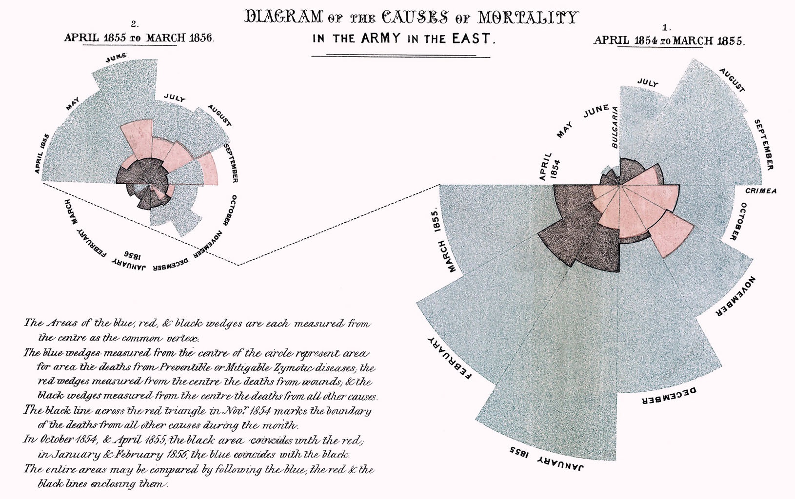
During the Crimean War (1853-1856), Florence Nightingale collected data revealing that the majority of British military deaths resulted not from combat wounds but from preventable diseases caused by poor sanitary conditions. To communicate this sanitary reform crisis to policymakers, she created her iconic “coxcomb” or polar area diagram—a pioneering data visualization that made mortality patterns immediately apparent through proportional wedge areas. Her compelling visual argument directly influenced British military policy, leading to comprehensive hospital reforms and establishing data visualization as a powerful tool for driving evidence-based change.
How the Data Was Collected
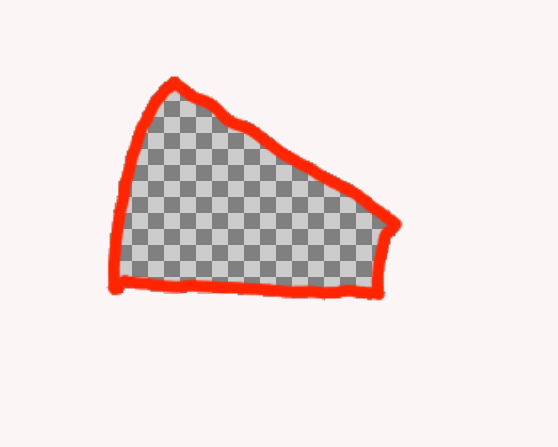
Since there is no exact mortality count, we estimate it by measuring the wedge areas ourselves. Here’s the workflow:
- Extract individual wedge areas
- Open the original diagram in a drawing app (I used Krita) and trace the outline of each wedge.
- Use a photo editor to make the wedge area transparent, then save each wedge as a PNG with an alpha (transparency) channel.
- Save all wedge images in one folder using the format
yyyy-mm_(cause_of_death).png. - Example of a transparent wedge area:
- Count transparent pixels
- Use Python to count the transparent pixels in each PNG to estimate the wedge area.
- Save the pixel counts to a CSV for later processing.
The Math and Visualization
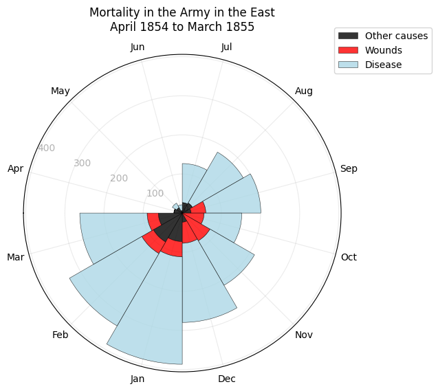
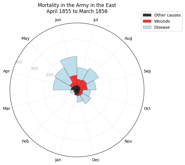
- With area being pixel count, the propotion of the radii can be represent by the square root of the area. Therefore, the radii can be calculated by getting the square roots of pixel counts of each categories.
radii_other = np.sqrt(df['other'])
radii_wound = np.sqrt(df['wound'])
radii_disease = np.sqrt(df['disease'])
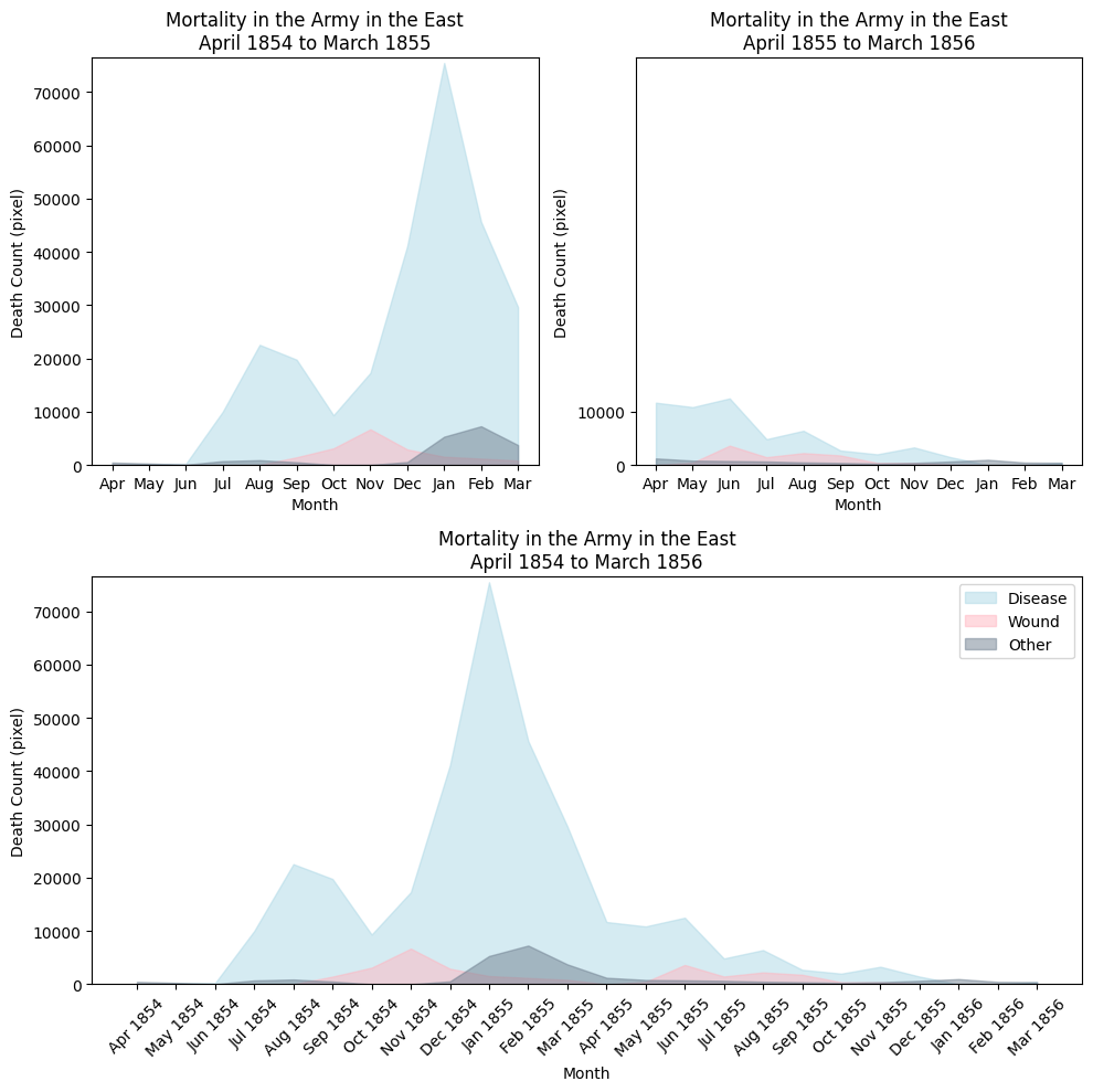
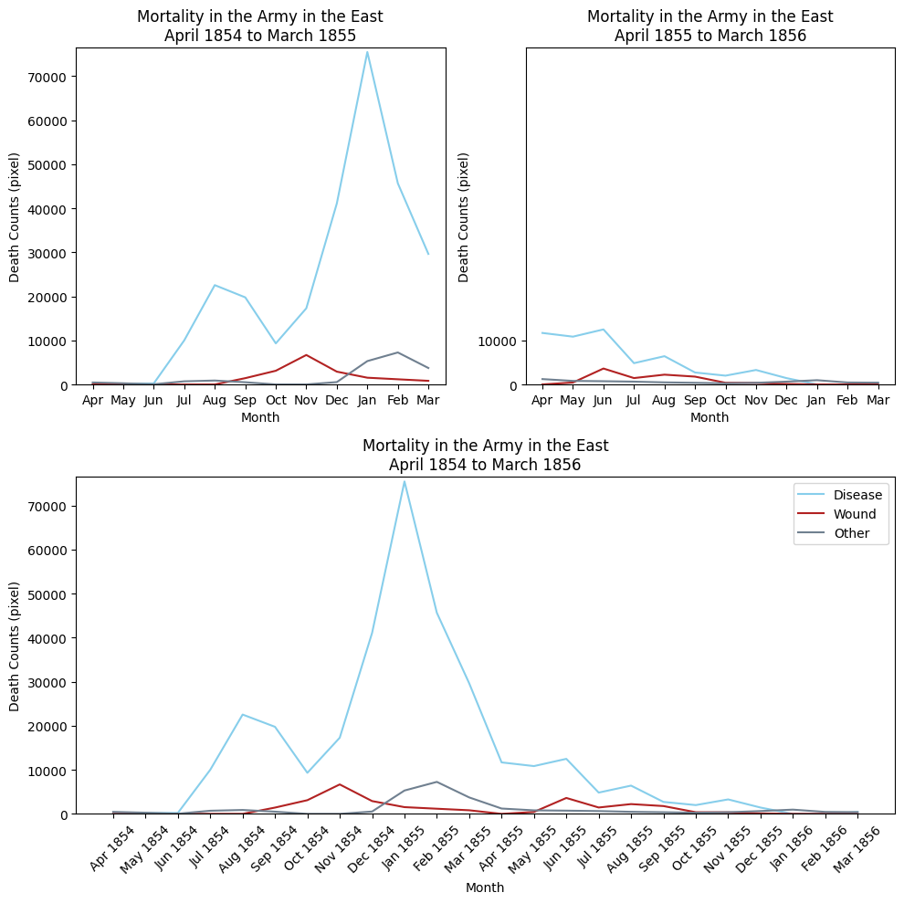
The Visualization
Some other ways of visualization
Key Insights
- Before sanitation reforms (1854–1855): Deaths from disease overwhelmingly dominated battlefield and other causes, with dramatic monthly spikes showing that preventable illness—not combat—was the primary driver of mortality.
- After sanitation reforms (1855–1856): Disease-related deaths declined sharply and remained relatively low, making overall mortality more stable and demonstrating the substantial impact of improved hygiene and medical practices.
- The plot shows the great contrast of the propotion between the blue area (disease), and the red area (wounds).
- The contrast make it convincing that sanitation is indeed a significant factor in mortality counts. There might be limitation for polar chart too. Firstly, it would be hard to show to overall trend of the data. Secondly, for 2 similar counts, it would be hard to tell the difference because human is not sensitive to area. The limitations would be compensate by some alternative visualization ways.
Technical Details
- Language: Python
- Libraries:
datetimePIL.imagenumpypandasmatplotlib.pyplot
- Files:
src/Nightingale_Final_Submission.ipynb
data/result.csv
How to Run
- Clone this repository.
- Install requirements
- Run the Data Visualization section of jupyter notebook <!– 1. Clone this repository.
- Create and activate a virtual environment (optional).
- Install requirements (if you have a
requirements.txt). - Run the plotting script:
python src/plot_rose.py–>
What I Learned
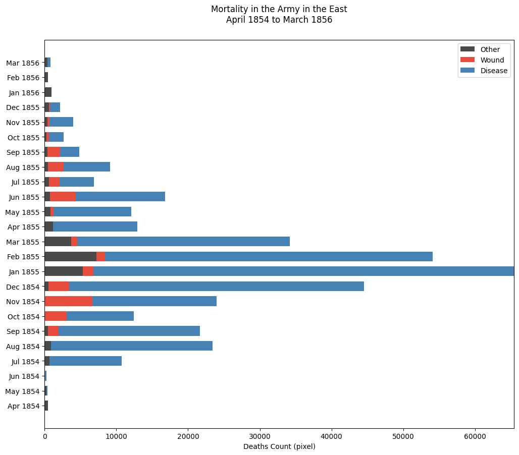
Challenge of Stacked bar chart: The challenge of Stacked bar chart is that the contrast of value among months can be very large. To address the issue of large contrasts between months, which makes it difficult to see months with smaller counts, I adjusted the x-axis limit by cutting it by 10,000 to hide the longer part of some bars. ax.set_xlim(0, max(df[:12]['disease'])-10000)
References
https://scientificallysound.org/2017/09/07/matplotlib-subplots/
https://matplotlib.org/stable/gallery/lines_bars_and_markers/horizontal_barchart_distribution.html
https://jingwen-z.github.io/data-viz-with-matplotlib-series7-area-chart/
https://towardsdatascience.com/enhance-your-polar-bar-charts-with-matplotlib-c08e332ec01c/
https://towardsdatascience.com/7-steps-to-help-you-make-your-matplotlib-bar-charts-beautiful-f87419cb14cb/
https://matplotlib.org/3.2.2/gallery/lines_bars_and_markers/bar_stacked.html#sphx-glr-gallery-lines-bars-and-markers-bar-stacked-py
https://stackoverflow.com
https://matplotlib.org/stable/